Spindrift Lemon Sparkling Water
Spindrift: Lemon Sparkling Water Spec Ad Overview
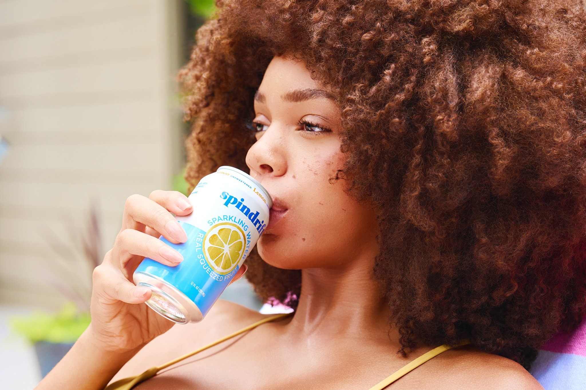
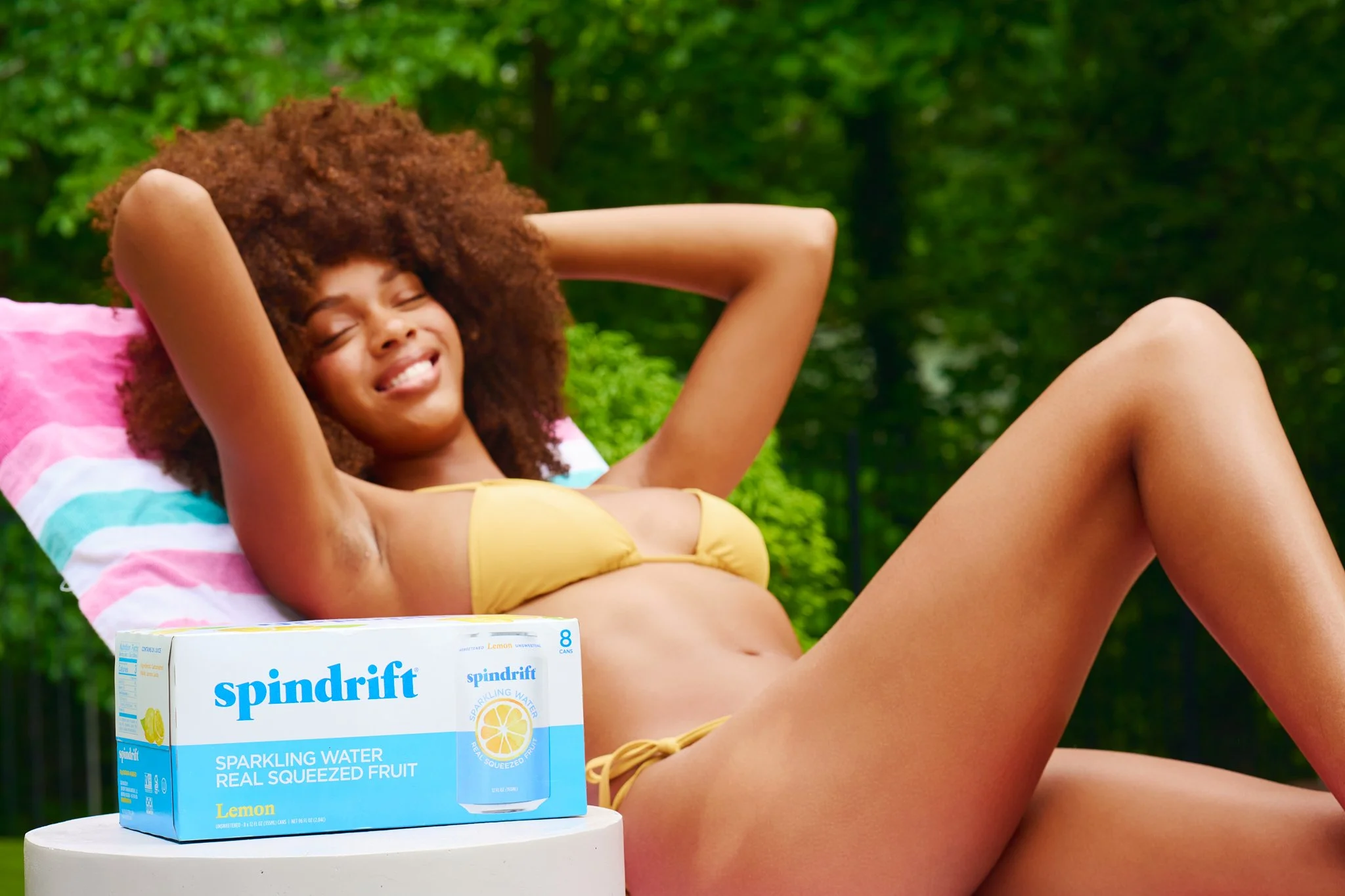
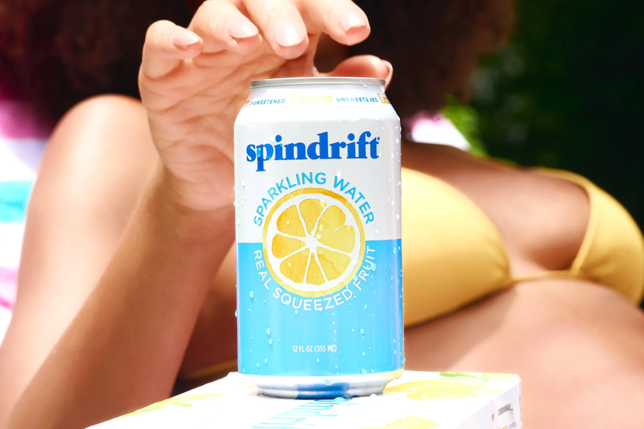
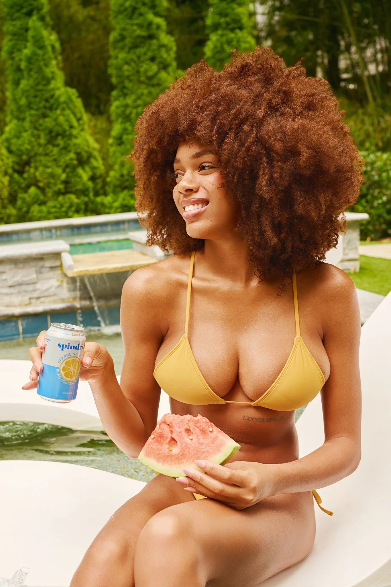
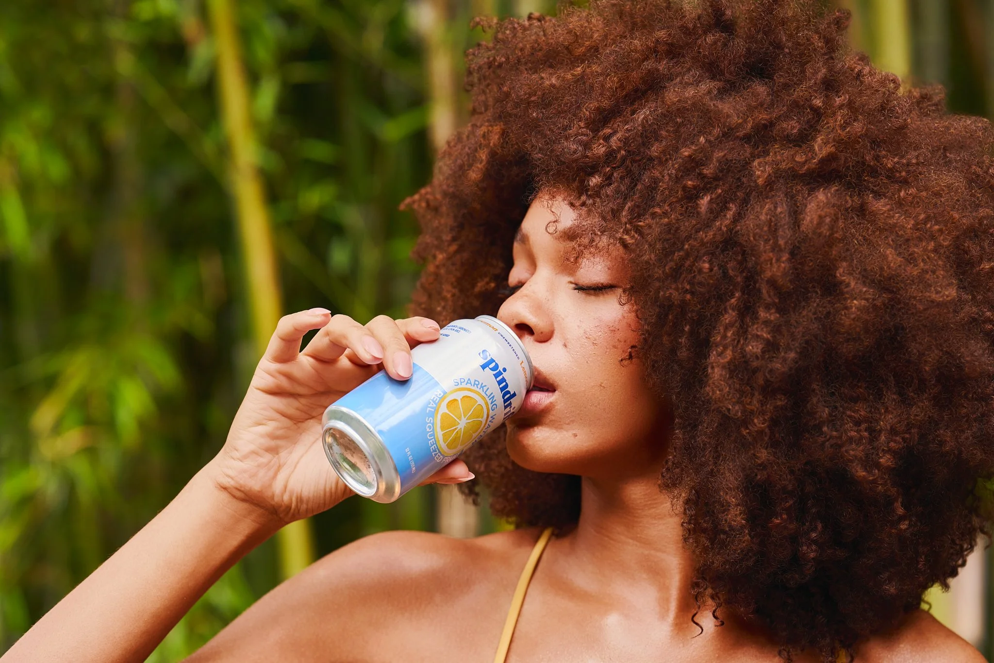
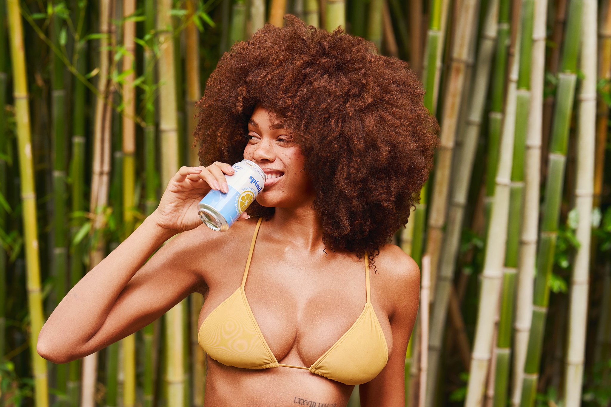
This spec campaign reimagines Spindrift Lemon as the ultimate warm-weather refreshment: bright, crisp, fruit-forward, and effortlessly woven into a poolside summer moment. Inspired by Spindrift’s real squeezed fruit identity, the campaign uses sunlit lifestyle imagery, clean product placement, fresh color styling, and natural movement to position Lemon as a drink that feels both refreshing and easy to reach for.
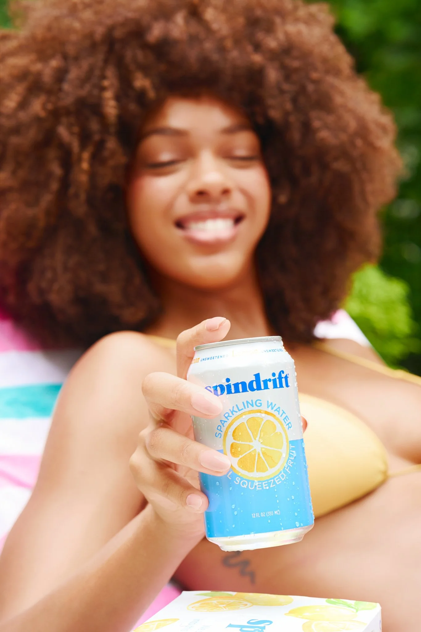
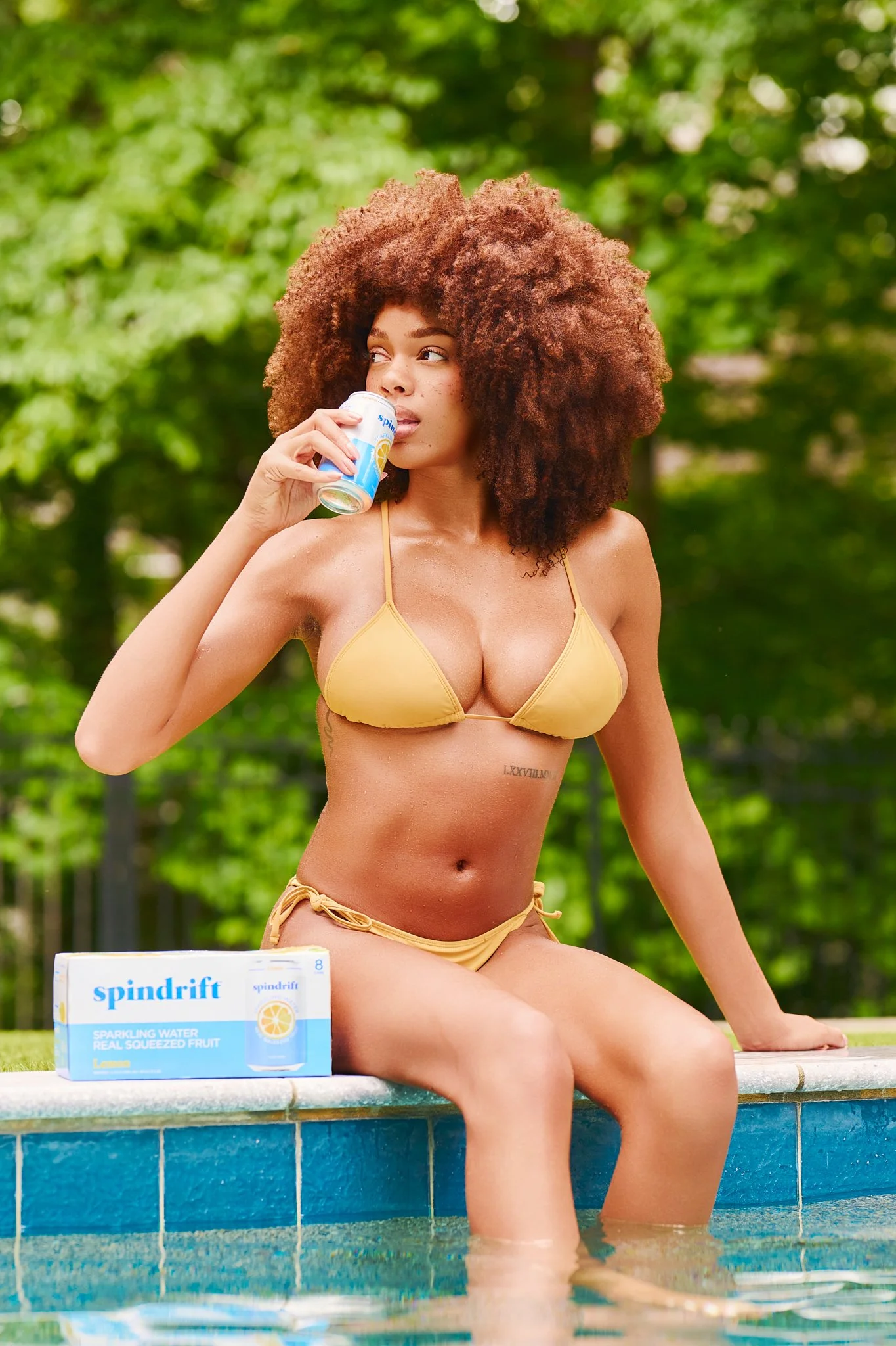
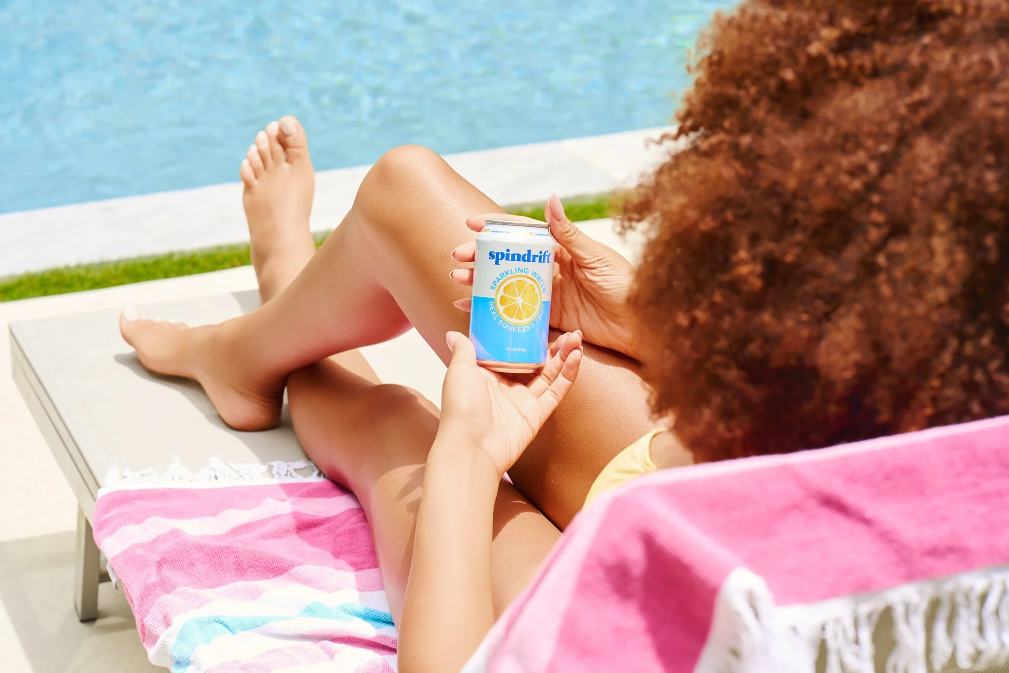
Through product-in-hand moments, chilled can close-ups, relaxed poolside portraits, and citrus-aligned wardrobe styling, the story captures Spindrift as more than a sparkling water. It becomes part of the rhythm of summer: lounging by the pool, cooling off between dips, enjoying fresh fruit, and reaching for something light, cold, and real. The campaign balances UGC-style relatability with polished campaign execution, creating visuals that feel organic enough for social media while still refined enough for brand, web, and paid marketing use.
Visual Assets

Results
This campaign demonstrates our ability to translate Spindrift’s core brand identity, including real fruit, natural refreshment, ingredient clarity, and everyday lifestyle appeal, into vibrant, social-ready visuals for beverage, wellness, and consumer lifestyle brands.
Campaign and Channel Alignment: Bright natural light, blue pool tones, lemon-yellow wardrobe, lush greenery, and clean product visibility were used to mirror Spindrift’s fresh, fruit-forward brand world. The final imagery could support seasonal campaigns, summer product pushes, retail marketing, email graphics, website banners, paid ads, and flavor-specific social storytelling.
UGC and Social Adaptability: The campaign includes a mix of creator-style product moments, lifestyle portraits, hand-held can shots, and natural drinking imagery that can easily translate across Instagram, TikTok, Reels covers, Stories, paid social, and organic content. The approachable styling gives the brand flexible assets that feel native to social while still maintaining a polished visual standard.
Product Benefits Made Visual: Spindrift Lemon’s crisp, refreshing identity is highlighted through condensation-covered cans, close-up product framing, bright poolside lighting, and lemon-inspired color styling. The imagery makes the drink feel cold, clean, and immediately desirable while reinforcing the brand’s real-fruit positioning in a simple, visual way.
Lifestyle Integration: By placing Spindrift in a relaxed poolside setting, the campaign shows how naturally the product fits into warm-weather routines, outdoor lounging, and casual summer moments. The visuals feel aspirational without being overly staged, allowing the product to live within a real lifestyle environment that consumers can immediately understand and connect with.
Proof of Concept: This project serves as a strong proof of concept for our ability to create body care imagery that elevates brand perception, makes hydration benefits feel visually tangible, and resonates emotionally with consumers seeking softness, comfort, and everyday luxury.